
Image Formats: WebP, AVIF, and What to Use
Images are usually the heaviest thing on a page. Even on text-heavy sites, a single hero image often outweighs all the HTML, CSS, and JS combined. Get the format wrong and you ship two or three times the bytes you actually need.
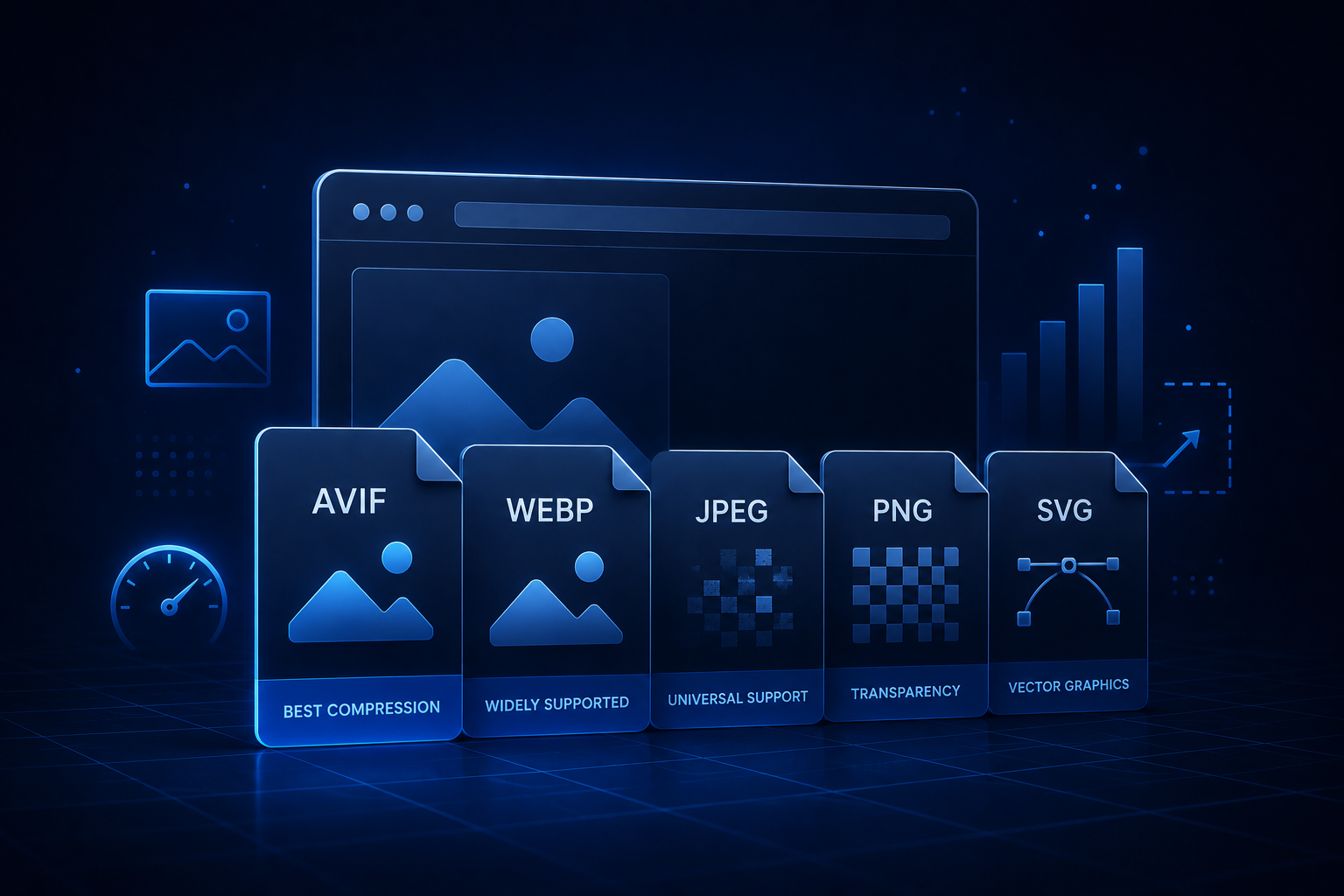
This post is about picking image formats deliberately in 2026. The short answer: AVIF when you can, WebP as the broad default, JPEG and PNG for fallbacks and edge cases, SVG for anything that should be sharp at any size.
Where browser support landed
Browser support has shifted enough that we can finally use modern formats without contortions.
- AVIF — supported in Chrome, Edge, Firefox, and Safari 16.4+. Best compression on the web. Slower to encode.
- WebP — universally supported at this point. 25-35% smaller than equivalent JPEG. Fast to encode.
- JPEG — still everywhere. Excellent for photographs, terrible for anything with sharp edges or text.
- PNG — necessary when you need transparency or pixel-perfect graphics and can’t use AVIF or WebP.
- SVG — for icons, logos, charts, any vector content. Stays sharp at any zoom.
JPEG XL had a moment, but Chromium dropped support in 2022 and never brought it back. Safari supports it. In practice, that means JPEG XL isn’t a serious option for the open web in 2026.
What to use where
| Use case | First choice | Fallback |
|---|---|---|
| Photographs (hero, blog) | AVIF | WebP, then JPEG |
| Screenshots, UI captures | WebP | PNG |
| Logos, icons, illustrations | SVG | PNG |
| Transparent graphics | AVIF or WebP | PNG |
| Animations | WebP (animated), video | GIF (avoid) |
A note on GIFs: don’t. An MP4 or WebM is dramatically smaller for the same animation. A 2MB GIF is routinely a 200KB MP4. If you need autoplay-on-scroll silent video, that’s what <video autoplay muted loop playsinline> is for.
The <picture> element
When you want different formats for different browsers, <picture> is the standard tool.
<picture>
  <source srcset="hero.avif" type="image/avif" />
  <source srcset="hero.webp" type="image/webp" />
  <img src="hero.jpg" alt="..." width="1200" height="800" />
</picture>
The browser picks the first format it supports. Modern browsers get AVIF, slightly older ones get WebP, and the JPEG is there as a final fallback (though in 2026, you may not need it).
Two things people get wrong here:
- Forgetting
widthandheighton the<img>. The browser needs them to reserve space and avoid layout shift. - Mixing up
<picture>andsrcset. They serve different purposes:<picture>switches formats,srcsetswitches resolutions. You often want both.
Responsive images
For images that scale, use srcset with sizes:
<img
  src="photo-800.webp"
  srcset="photo-400.webp 400w, photo-800.webp 800w, photo-1600.webp 1600w"
  sizes="(max-width: 768px) 100vw, 800px"
  width="800"
  height="600"
  alt="..."
/>
This tells the browser: here are the variants, here’s how the image will be displayed at different viewport sizes, pick the smallest one that won’t look bad.
The sizes attribute is what most developers get wrong. It describes the rendered size of the image, not the source size. Skip it and browsers fall back to assuming the image is 100% of the viewport, which usually downloads more than necessary.
How to actually generate these
Manually exporting every image in three formats and four sizes is a special kind of hell. Use tooling.
- Build-time: Astro’s
Imagecomponent, Next.js’snext/image, Gatsby’sgatsby-plugin-image, Eleventy’s image plugin. All of these generate multiple sizes and formats automatically and emit<picture>for you. - CDN-based: Cloudinary, Imgix, Cloudflare Images, Vercel’s image optimization. Upload once, request any format and size on demand via URL parameters.
- Pre-processing: Sharp (Node), libvips, ImageMagick, or
cwebp/avifencfrom the command line. Useful when your CMS doesn’t handle this for you.
For static sites, build-time is usually best. For dynamic content (user uploads, CMS-driven content), a CDN saves an enormous amount of work.
Quality settings that matter
Default encoder settings are rarely what you want.
- WebP: quality 80 is the sweet spot for photos. Quality 75 for images that are heavily compressed by layout.
- AVIF: quality 50-60 already looks excellent. AVIF’s scale isn’t linear with JPEG’s, so don’t reuse the same number.
- JPEG: quality 80-85 for hero images, 75 for thumbnails. Below 70 you’ll start to see artifacts on faces and gradients.
- PNG: no quality slider in the JPEG sense. Use
pngquantoroxipngto reduce file size losslessly (or near-losslessly).
We’ve shipped client sites where dropping AVIF quality from 80 to 55 cut image weight by half with no visible difference. The default of “max quality” is almost always wrong.
A common mistake: shipping huge originals
The most common image issue we find on client sites isn’t format — it’s resolution. A 4000x3000 photo from someone’s phone, embedded at 800px wide. The browser scales it down at display time. The user still downloaded all 4000 pixels.
Always resize images to the maximum size they’ll be displayed at (times 2 for retina), then compress. A single resize step is usually a bigger win than switching formats.
When SVG bites you
SVG is fantastic for icons and logos. It can also be a security and performance footgun.
- SVGs are XML. Inline SVGs you don’t control can include
<script>tags. Sanitize anything from users. - A “small” SVG with thousands of paths (complex illustrations, maps) can render slower than a PNG. Check the rendered cost.
- Use SVG sprite sheets or icon libraries for repeated icons rather than one inline SVG per icon.
For 90% of cases — logos, icons, simple illustrations — SVG is the right call.
A simple checklist
Before shipping any image, ask:
- Is it the right format? (AVIF/WebP for photos, SVG for vectors)
- Is it the right size for how it’s displayed? (Don’t ship 4000px to a 400px slot)
- Does it have
widthandheightattributes? (Prevents CLS) - Is it lazy-loaded if it’s below the fold? (
loading="lazy") - Is the LCP image eager-loaded? (
fetchpriority="high", no lazy) - Does it have meaningful alt text?
That last one isn’t about file size, but if you’re already optimizing images, you might as well fix accessibility while you’re in there. We wrote more about it in Alt Text for Images.
What to check on your site
If you want a quick read on how heavy your images are, the waterfall view in any of the major performance tools makes oversize images obvious. They’ll be the rows that take seconds to download. You can also run a quick check with our Performance Checker or look at the network panel in DevTools directly.
If you’re doing a redesign or migration, that’s the right time to switch formats wholesale. Doing it piecemeal later is significantly more painful — you end up with a mix of formats and quality levels that nobody can keep track of.
For help with performance, image pipelines, or a full site audit, reach out.
Need help shipping?
We help teams build and ship software that works. Performance, SEO, features, weekly demos, full ownership.
Get a Free Audit