
Color Contrast: WCAG Compliance Guide
One in twelve men and one in 200 women have some form of color vision deficiency. Millions more have low vision or view screens in challenging lighting conditions.
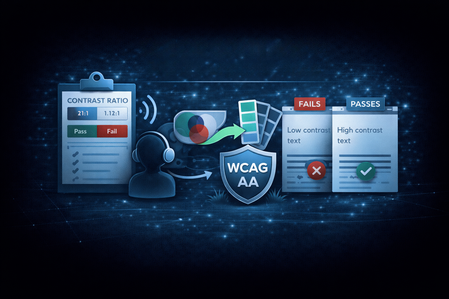
Color contrast determines whether people can read your content. WCAG (Web Content Accessibility Guidelines) sets the standards, and failing to meet them can mean legal liability and lost users.
Understanding contrast ratio
Contrast ratio measures the luminance difference between foreground and background colors. The scale runs from 1:1 (identical colors) to 21:1 (black on white).
How it’s calculated
The formula compares relative luminance:
Contrast Ratio = (L1 + 0.05) / (L2 + 0.05)Where L1 is the lighter color’s luminance and L2 is the darker.
You don’t need to calculate this manually. Tools do it for you.
WCAG requirements
AA level (minimum)
- Normal text: 4.5:1 contrast ratio
- Large text (18pt+ or 14pt+ bold): 3:1 contrast ratio
- UI components and graphics: 3:1 contrast ratio
AAA level (enhanced)
- Normal text: 7:1 contrast ratio
- Large text: 4.5:1 contrast ratio
Most organizations target AA. AAA is recommended for critical content like medical or legal information.
What counts as large text
WCAG defines large text as:
- 18 point (24px) or larger for regular weight
- 14 point (18.66px) or larger for bold (700+)
Large text can use lower contrast because it’s inherently more readable.
Common contrast problems
Light gray on white
Popular in modern design, often fails:
/* Fails AA - ratio ~2.5:1 */
color: #999999;
background: #ffffff;

/* Passes AA - ratio ~4.5:1 */
color: #767676;
background: #ffffff;
Colored text on colored backgrounds
Brand colors often clash:
/* Might fail depending on specific colors */
color: #0088cc; /* Light blue */
background: #f0f8ff; /* Lighter blue */
Placeholder text
Default placeholder colors are often too light:
/* Browser default - typically fails */
::placeholder {
  color: #a9a9a9; /* ~2.9:1 on white */
}

/* Better */
::placeholder {
  color: #757575; /* ~4.6:1 on white */
}
Buttons and links
Interactive elements need sufficient contrast:
/* Might look stylish but fails */
.button {
  background: #f0f0f0;
  color: #c0c0c0;
}
Testing contrast
Manual testing
- Get the foreground hex color
- Get the background hex color
- Calculate or check the ratio
- Compare against WCAG thresholds
This is tedious for a whole site.
Our color contrast checker
The Color Contrast Checker makes it simple:
- Enter foreground and background colors
- See the contrast ratio instantly
- Get AA and AAA pass/fail for normal and large text
- Preview how the combination looks
It’s free and gives you immediate, actionable results.
Browser dev tools
Chrome and Firefox show contrast ratios in their color pickers:
- Open DevTools
- Select an element
- Click the color swatch in Styles
- See the contrast ratio and WCAG status
Automated audits
Lighthouse and axe-core check contrast automatically, but may miss:
- Dynamically generated content
- Text over images
- Complex overlays
Fixing contrast issues
Strategy 1: Darken the Foreground
Often the easiest fix. Make text darker:
/* Before - fails */
color: #888888; /* 3.5:1 on white */

/* After - passes */
color: #595959; /* 7:1 on white */
Strategy 2: Lighten the Background
If you can’t change the text:
/* Before - fails */
color: #ffffff;
background: #888888; /* 3.5:1 */

/* After - passes */
color: #ffffff;
background: #595959; /* 7:1 */
Strategy 3: Increase Text Size
If color changes break the design:
/* At 14px, needs 4.5:1 */
/* At 18px bold, needs only 3:1 */
.text {
  font-size: 18px;
  font-weight: 700;
}
Strategy 4: Add a Background
For text over images:
.overlay-text {
  background: rgba(0, 0, 0, 0.6);
  padding: 1rem;
}
Color and meaning
WCAG also requires that color not be the only way to convey information:
Bad
<!-- Red text means error, green means success -->
<span style="color: red">Error</span>
<span style="color: green">Success</span>
Good
<span style="color: red">❌ Error: Invalid email</span>
<span style="color: green">✓ Success: Form submitted</span>
Add icons, text labels, or patterns in addition to color.
Designing for contrast
Build it in early
Check contrast during design, not after development. Fix it in Figma before writing code.
Use a limited palette
Define accessible color combinations upfront:
:root {
  --text-primary: #1a1a1a; /* 15:1 on white */
  --text-secondary: #595959; /* 7:1 on white */
  --text-muted: #767676; /* 4.5:1 on white - minimum for AA */
  --background: #ffffff;
}
Test across states
Check all states of interactive elements: default, hover, focus, active, and disabled.
Disabled states often fail contrast. That’s technically allowed but can hurt usability.
Beyond contrast ratio
Color blindness
Some color combinations are confusing regardless of contrast:
- Red/green (most common deficiency)
- Blue/yellow
- Full color blindness (rare)
Use patterns, icons, or labels in addition to color.
Testing for color blindness
Simulators show how your design looks to people with different types:
- Protanopia (red-blind)
- Deuteranopia (green-blind)
- Tritanopia (blue-blind)
Chrome DevTools has a “Rendering” panel with color vision deficiency emulation.
Legal considerations
In many jurisdictions, accessibility is legally required:
- US: ADA and Section 508
- EU: European Accessibility Act
- UK: Equality Act 2010
Organizations have faced lawsuits over inaccessible websites. WCAG AA is generally the baseline standard courts reference.
Quick wins
If you’re starting from scratch:
- Use
#1a1a1afor body text (near-black) - Keep decorative text (captions, labels) at least
#767676 - Test every color combination before finalizing the palette
- Use our Color Contrast Checker for quick verification
Take action
- Test your main text color with Color Contrast Checker
- Check placeholder text and muted colors
- Review buttons and links
- Run a Lighthouse accessibility audit for automated checks
For help with accessibility audits or design reviews, reach out.
Need help shipping?
We help teams build and ship software that works. Performance, SEO, features, weekly demos, full ownership.
Get a Free Audit